Green Dials In Indian Light: Does This Color Actually Work in Tropical Conditions?
There is a particular cruelty to how watch photography works. A green dial photographed in diffused studio lighting or under the overcast skies of Geneva looks mysterious, sophisticated, nearly black in shadow with flashes of emerald when light catches it just right. Then you step outside in Mumbai at noon in April and suddenly your elegant forest green dial is screaming lime at you like a traffic signal. This is not hypothetical. This happens. As brands descend on India Watch Weekend 2026 with their latest releases, one question worth asking is whether certain design choices survive the journey from European showrooms to Indian wrists. Green dials, having enjoyed a sustained moment in watchmaking over the past five years, present an interesting test case. Tutima arrives with the Patria 6612-98 in what they call evergreen, limited to 25 pieces worldwide. The dial is rich, textured, clearly expensive. But does it actually work here?
The Problem With Green
Green behaves differently than blue or black under strong light. Blue dials tend to deepen or shift toward purple in tropical sun. Black stays black, though you lose textural detail. Green goes bright. The chemical reason involves how chlorophyll-adjacent pigments reflect wavelengths in the 500 to 570 nanometer range, which intensifies under full-spectrum sunlight. The practical reason is that what looks subtle in Switzerland often looks loud in Chennai. This matters more in India than in markets where watches spend most of their time indoors or under cloud cover. If you are wearing a watch to an outdoor wedding in Jaipur or checking the time courtside at a cricket match in Bangalore, your dial is getting hit with roughly 100,000 lux of direct sunlight. For context, a well-lit office delivers about 500 lux. The intensity difference is not incremental. It changes everything about how color reads.
The Tutima Patria 6612-98: A Specific Shade
Tutima chose evergreen for the Patria, which sits somewhere between forest and hunter green with a textured finish they describe as décor. The dial measures 41mm across, fitted with polished steel hands carrying white Super-LumiNova that glows blue. The case is Grade 5 titanium, which saves weight but also affects how the dial color relates to surrounding metal. Titanium has a cooler, slightly grayer tone than steel, which can make warm greens look warmer and cool greens look more muted. The evergreen Patria dial leans cooler, which helps. Warm greens with yellow undertones turn almost chartreuse in harsh light, while cooler greens with blue or gray bases hold their composure better. Tutima seems to understand this, though whether they were thinking specifically about tropical markets or simply got lucky with the formulation is unclear. The texture matters significantly. A glossy green dial acts like a mirror, bouncing sunlight directly into your eyes and washing out detail. The Patria uses a textured finish that breaks up reflections and maintains depth even when fully illuminated. You can still read the dial at 2pm outdoors, which is not true of every green watch.
Comparisons Worth Making
To understand where the Patria sits in the green dial spectrum, it helps to consider what else is out there and how those watches perform under similar conditions.
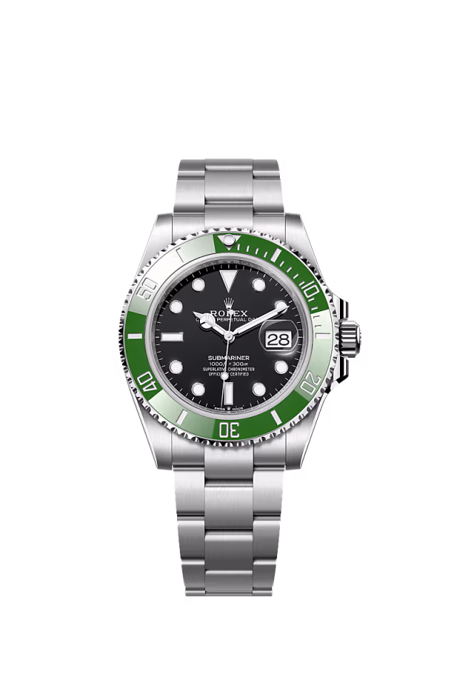
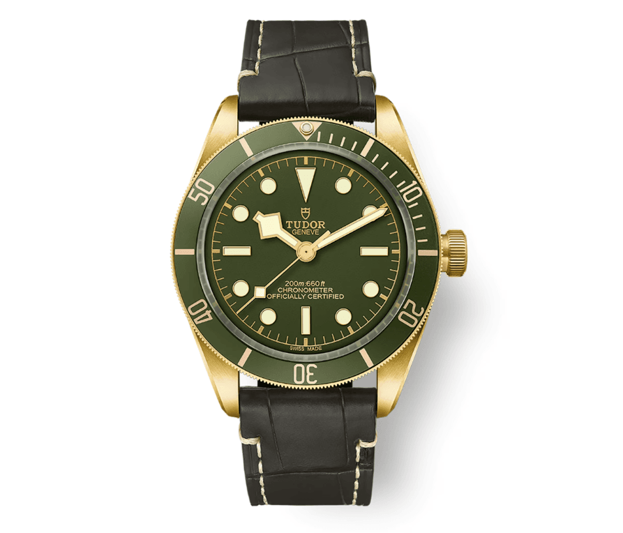
The Rolex Submariner 126610LV uses a green that Rolex calls simply green but everyone else calls Kermit or Starbucks depending on bezel configuration. The dial is glossy, nearly black in low light, vibrant but not garish in bright sun. Rolex has been formulating green dials since 2003 and clearly invested in getting the pigment right. The result is legible but boring, which is exactly what Rolex intends. The Tudor Black Bay Fifty-Eight in green uses a warmer, more olive tone that shifts noticeably depending on light. Indoors it reads almost khaki. In direct sun it goes bright but remains handsome because the warmth feels intentional rather than accidental. This is a summer watch that owns its brightness rather than fighting it.
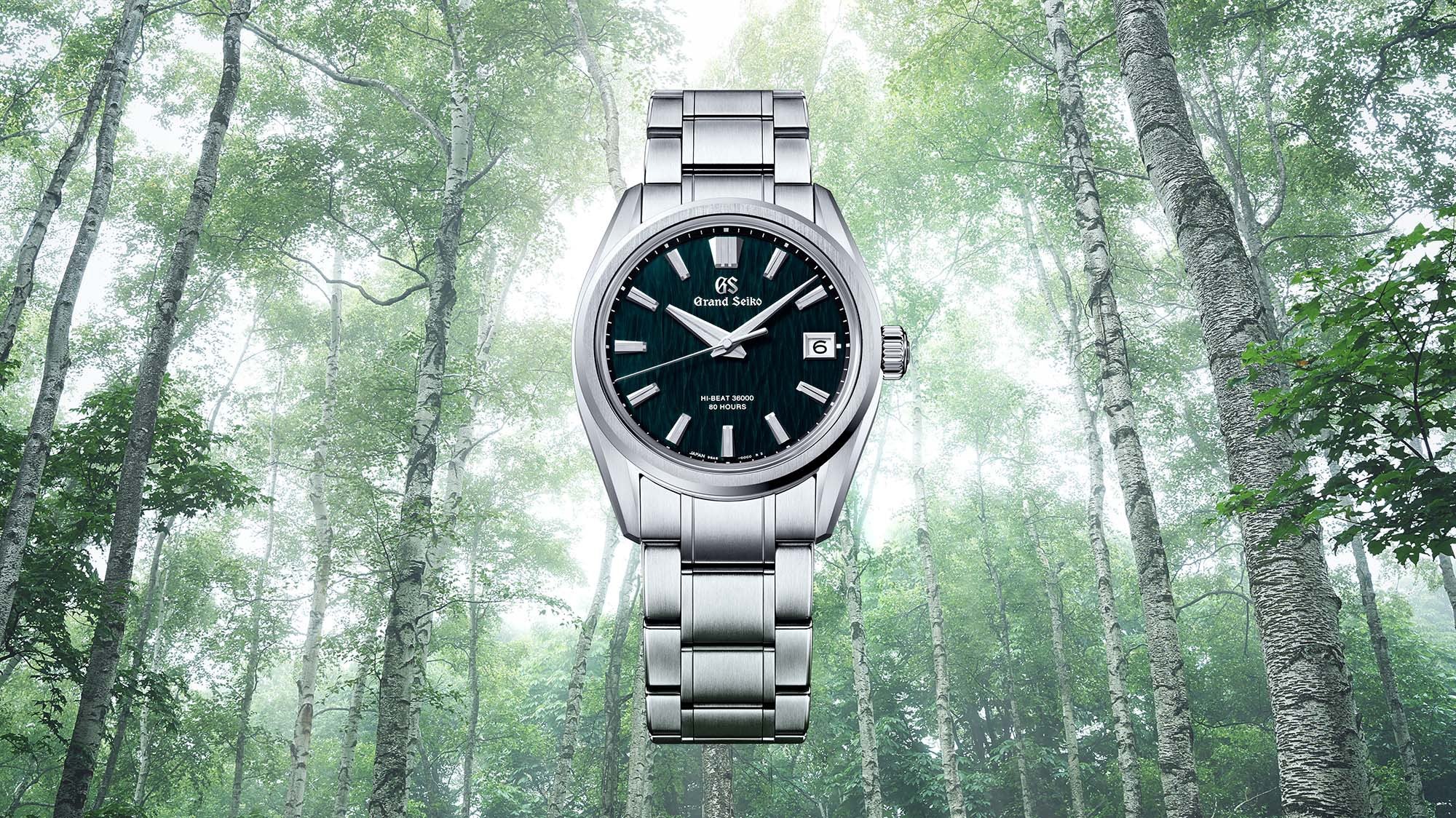
Grand Seiko has released several green dials recently, including the SLGH0011 with a dial inspired by forest moss. The texture is extraordinary, achieved through a stamping process that creates micro-variations across the surface. In strong light, the texture saves it. Instead of going flat and bright, the dial holds depth because shadows remain in the recessed areas. This is expensive to produce, which is why Grand Seiko charges accordingly.
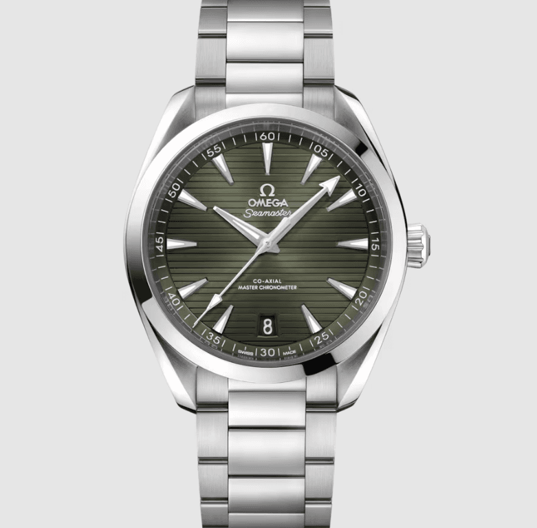
The Omega Seamaster Aqua Terra in green uses a teak-pattern dial that also relies on texture to manage light. In tropical conditions, the horizontal grooves create enough shadow play that the dial never looks one-dimensional. This approach works but requires precise execution. Cheap teak-pattern dials look like plastic lawn furniture in bright sun. The Tutima Patria sits closer to Grand Seiko than Tudor in terms of texture complexity, though at 25 pieces worldwide it is effectively unavailable for direct comparison. What matters is that Tutima committed to a textured finish rather than taking the easier path of a flat or sunburst dial. Given the price point, around $9,000 for a manually wound time-only watch in titanium, the finish needs to justify itself. In Indian light, it likely will.
Practical Legibility Testing
If you actually want to assess whether a green dial works for you in Indian conditions, here is what to check.
First, look at the watch indoors under artificial light and memorize exactly what shade of green you see. Then take it outside at midday and see what happens. If the color shifts more than one full shade, meaning dark forest becomes bright kelly, you will eventually find this irritating.
Second, test dial legibility while moving. Stand in full sun and check whether you can read the time instantly or whether you need to angle the watch to reduce glare.
Third, photograph the watch on your wrist outside and see whether it looks how you remember it looking. Cameras often exaggerate what the eye compensates for naturally.
Fourth, wear the watch for a full day that includes both indoor and outdoor time, then assess whether the color shift bothers you. Some people enjoy the chameleonic quality of dials that change dramatically with lighting.
The Cultural Question
There is also the question of whether green carries specific associations in Indian culture that affect how a watch is received. Green appears prominently in Indian textiles, architecture, and religious contexts, often associated with nature, prosperity, and new beginnings. This could work in favor of green dial watches, making them feel culturally resonant rather than imported European trend. At the same time, bright green in menswear can read as loud or unrefined depending on context. A dark forest green dial on a thin leather strap has different connotations than a bright green dial on a rubber strap. The Tutima Patria, with its evergreen alligator strap and slim 11.2mm case profile, positions itself as formal enough for business wear, which is likely the right approach for the Indian market.
What to Expect at India Watch Weekend 2026
India Watch Weekend will offer the first opportunity for many collectors to see multiple green dial watches side by side under actual Indian lighting conditions. This is valuable. Photographs lie. Marketing materials exaggerate. Boutique lighting obscures. Seeing a watch under the same harsh sun it will experience daily tells you everything you need to know about whether the design translates. If you are considering the Tutima Patria in green or any other green dial watch, pay attention to how the color behaves between indoor and outdoor viewing areas. Walk outside with the watch on your wrist. See whether you still like it. Then walk back inside and see if it disappears or holds presence. A good green dial should work in both contexts without feeling like two different watches. The Patria has advantages here. The 41mm case size means the dial has enough surface area to show textural detail even in bright light. The hand-polished steel hands provide strong contrast against the green, which matters for legibility. The blue lume adds a complementary color that prevents the dial from feeling monochromatic. And the manual wind Cal. 617 movement visible through the caseback gives you something other than the dial to appreciate when the lighting makes the green look wrong.
The Honest Assessment
Green dials in Indian light are not inherently problematic, but they require more careful consideration than blue or black. The color will behave differently here than in European or North American markets. It will shift more dramatically between indoor and outdoor viewing. It will photograph differently than it looks in person. And it will either age beautifully or feel dated depending on whether the specific shade and finish were chosen thoughtfully or trend-chasing.