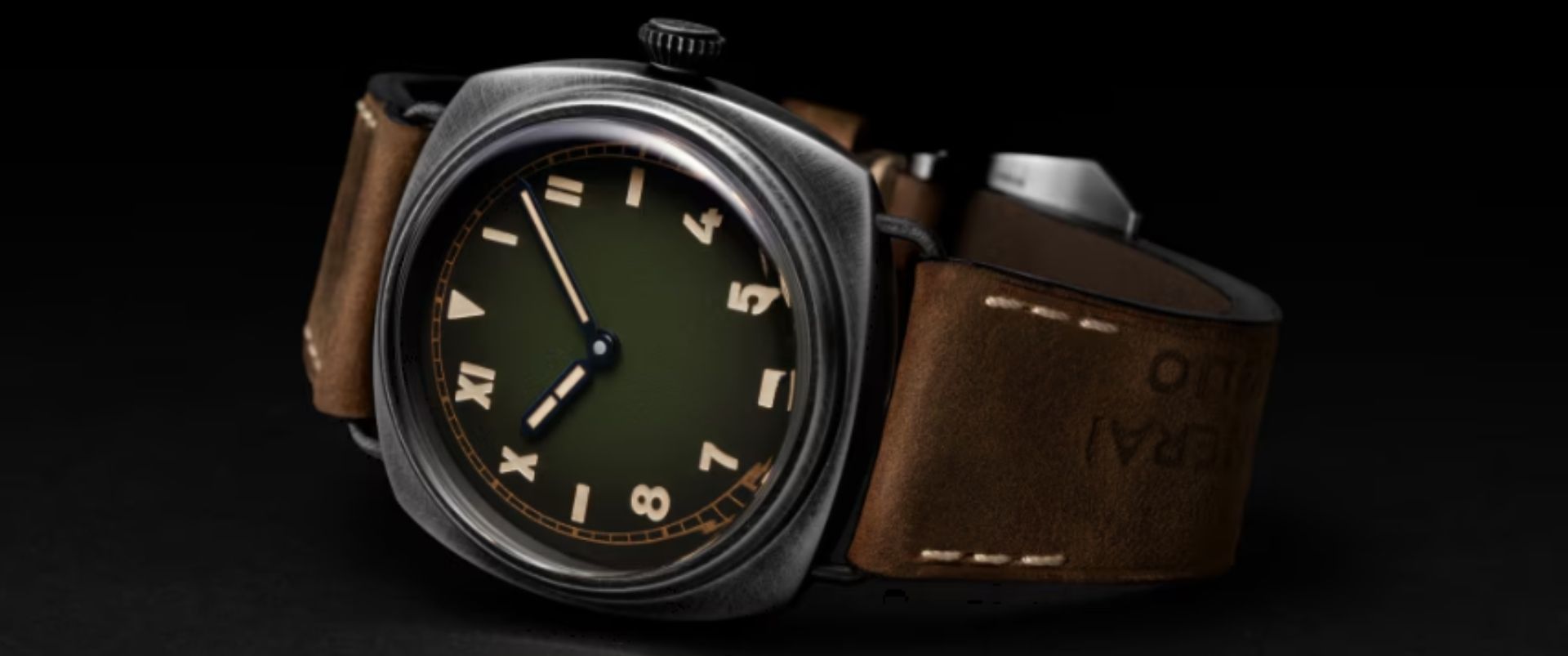
Panerai's California Dial: Why Collectors Keep Coming Back
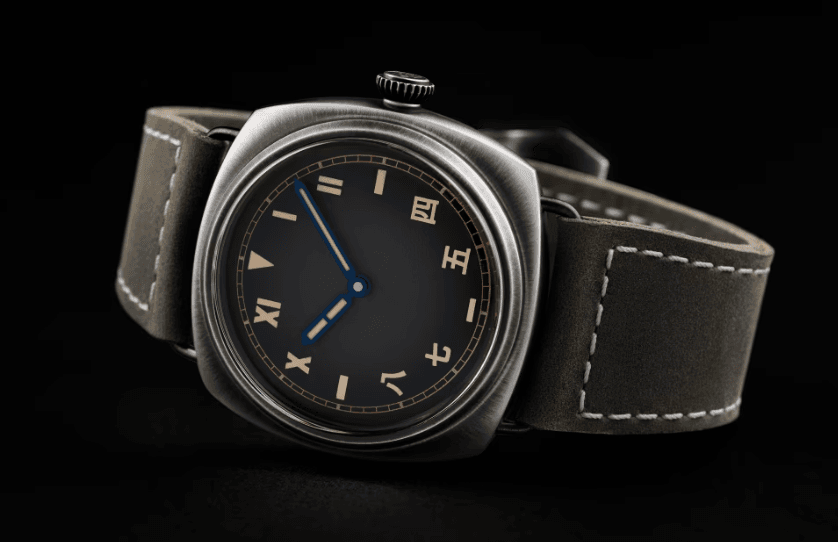
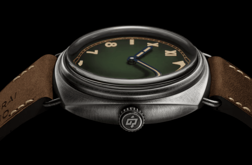
The California dial looks like a mistake at first glance. Roman numerals crowding the upper half, Arabic numerals below, stick markers at the cardinals. It reads like someone couldn't decide which numeral system to use and gave up halfway through. Yet this schizophrenic layout has become one of Panerai's most recognized dial configurations, appearing on everything from limited editions to core collection pieces. The question isn't whether it works visually, clearly it does for enough people. The question is why a design born from wartime necessity continues resonating eight decades later.
Rolex filed a patent for this dial design in 1941, receiving Brevet 221643 on July 15, 1942. The patent specified hour markers combining Roman and Arabic numerals. Rolex never officially called it a California dial. That name emerged in the 1980s when dial restorers in California began refinishing vintage pieces with this configuration. The term initially carried negative connotations. Jeffrey P. Hess asserts that California dial denoted fake dials redone to trick buyers. Four decades on, the watch community accepts it as legitimate nomenclature. Panerai's history gets murky here. According to Panerai historian Jose Pereztroika, Rolex supplied California dials made by Stern Frères to Panerai in 1944, contradicting Panerai's claim that its 1936 prototypes featured this style. Research suggests California dials appeared on Panerai watches in 1944 during Nazi occupation when Panerai could no longer produce sandwich dials. Many of these wartime watches were left completely anonymous, with no brand markings, because Panerai didn't want association with occupying German forces and knew payment wouldn't come. The watches went to Kampfschwimmer, German combat divers training under the Decima MAS unit in occupied Italy.
Function Over Aesthetics
The standard explanation claims mixed numerals aided underwater orientation. Roman numerals X to II provided tradition while Arabic numerals 4 to 8 added contrast, with a triangle at 12 and stick markers at 3, 6, 9 completing symmetrical layout. The triangle at twelve functioned as immediate orientation marker. One theory suggests Roman numerals indicating the upper part helped interpret time in bad visibility, particularly when viewing a teammate's watch from odd angles underwater. Rolex advertised this as the "error proof dial" due to exceptional legibility. The layout also provided easily paintable surfaces for radium on relatively small watch faces. Simple geometric shapes at cardinal positions accepted thick lume applications better than complex numerals at every hour marker.
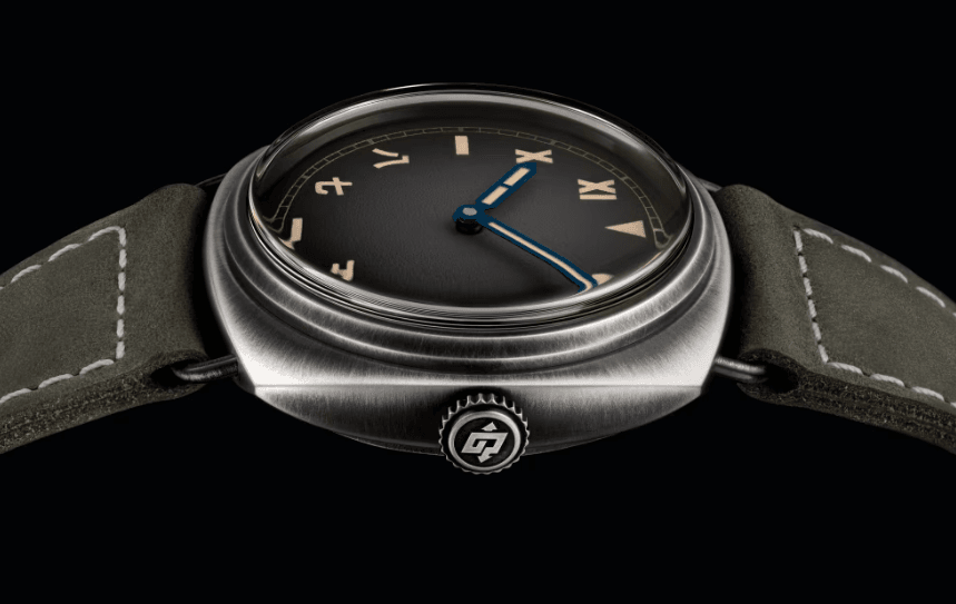
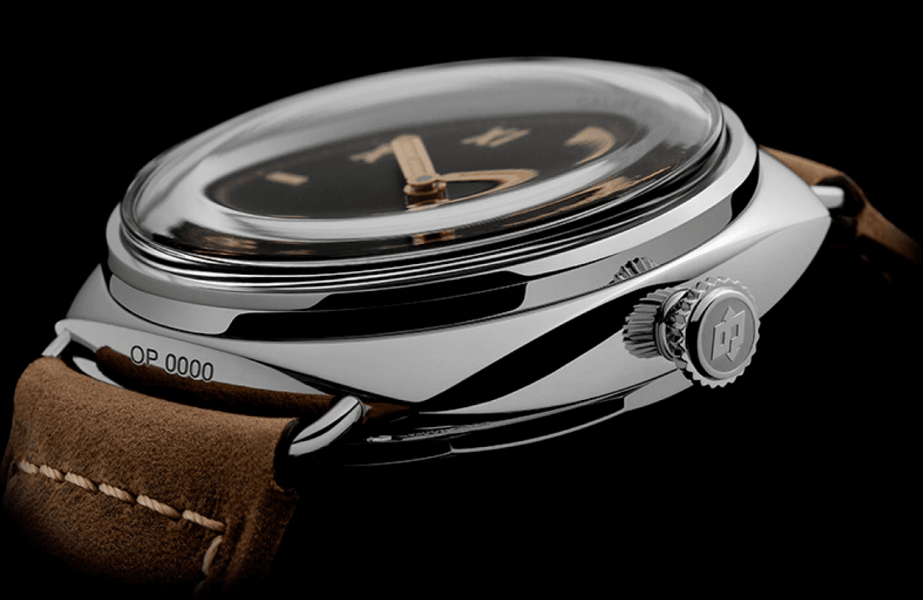
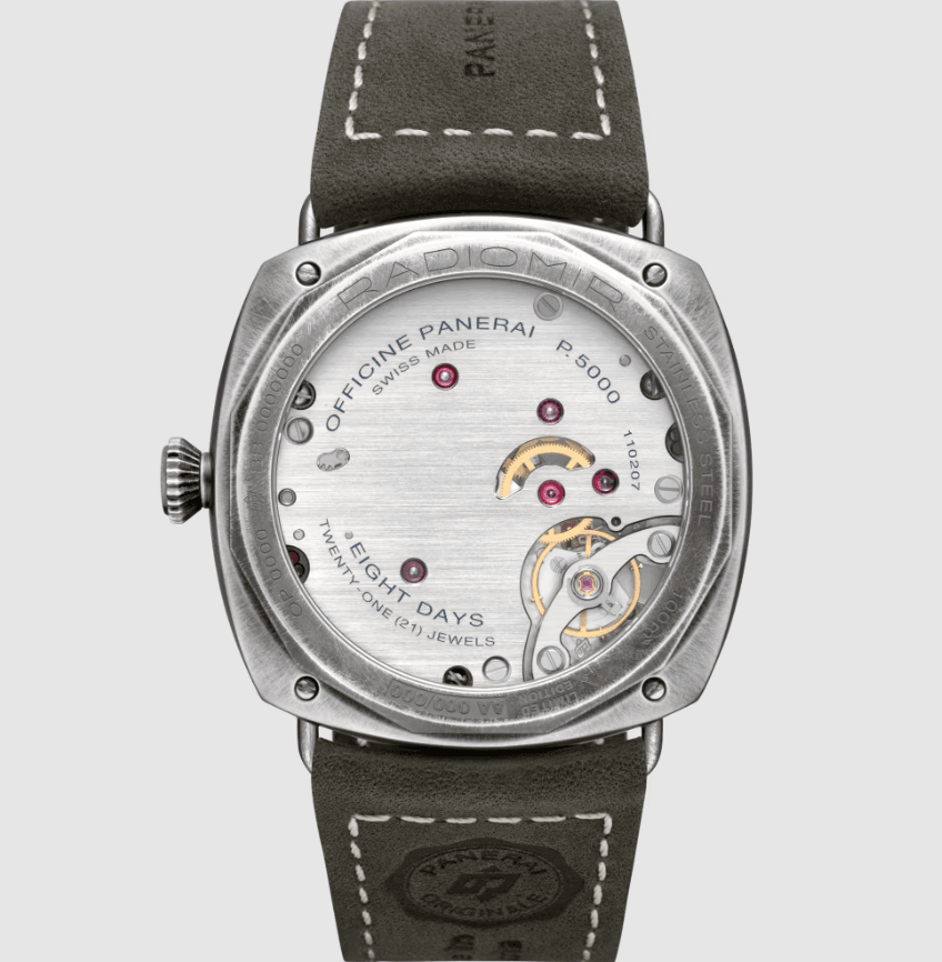
Modern Panerai embraces the California dial extensively. The brand releases California variants regularly, officially using the term where Rolex never did. Examples include the Radiomir 1936 PAM00249, PAM00931, PAM00448, PAM00424, and Luminor California PAM00779. The PAM00249, released in 2006, deserves attention. Limited to 1,936 pieces, it featured 47mm cushion case with wire lugs, Plexiglass crystal, and unmarked dial with no brand name, standard for wartime military watches. Panerai chose this despite modern marketing demanding prominent branding. The PAM00779 houses the P5000 caliber with eight day power reserve via two barrels. The 44mm black DLC titanium case represents modern material application to historic design. The California dial succeeds for Panerai because it connects directly to the brand's most legitimate heritage claim: supplying Italian military frogmen during World War II. The dial configuration signals military provenance more effectively than sandwich dials because it carries specific wartime narrative weight.
The Aesthetic Argument
Stripped of historical context, does the California dial work visually? The answer splits enthusiasts. Some find the mixed numerals charming, others indecisive. The layout creates strong vertical symmetry that round dials with uniform markers lack, emphasizing the cushion case's vertical dimension. Reviewers note the California dial draws comments from strangers attracted by the large dial with mixed numerals. This suggests visual distinctiveness beyond enthusiast appreciation. The dial reads as deliberately unconventional rather than accidentally confused. The faux-patina lume on modern California dial Panerais matches beige leather straps and gold-toned hands, creating cohesive vintage aesthetic. This works when Panerai commits fully - Plexiglass crystals, unmarked dials, wire lugs. It falls flat when California dials appear on otherwise contemporary pieces.
California dial Panerais occupy specific collector territory. Vintage Rolex 3646 examples with original California dials command high prices due to rarity, but authentication proves difficult. Many dials were refinished in the 1970s and 1980s, making originality assessment challenging. Modern Panerai California pieces face different challenges. The PAM00249 succeeded as limited edition. Core collection California models like the PAM00424 priced around €7,500 compete with numerous Radiomir variants at similar prices. The California dial must carry enough appeal to justify choosing it over cleaner alternatives. The dial works best on 47mm Radiomirs where the large canvas provides space for the numeral mix to breathe. On smaller cases or Luminor models with crown guards, the layout can feel cramped.
What This Reveals About Panerai's Strategy
The California dial's continued presence in Panerai's lineup signals brand positioning priorities. Panerai could abandon it entirely, focusing on sandwich dials and simple Arabic numerals that carry equally legitimate heritage claims. Instead, the brand returns repeatedly to California configurations because they communicate specific narrative: wartime Italian military service, Rolex collaboration, anonymous unbranded tool watches. This narrative differentiates Panerai from modern tool watch competitors. Tudor, Omega, and others claim diving heritage, but few can point to watches left unmarked because the manufacturer refused association with occupying forces. The California dial serves as shorthand for that story, instantly recognizable to those who know it and intriguing to those who don't.
Whether this justifies choosing a California dial over alternatives depends on individual priorities. If the historical connection matters, if the unconventional numeral mix appeals, if the vertical symmetry works with your wrist and wardrobe, the dial succeeds. If you prefer cleaner layouts or question the historical accuracy of Panerai's claims, numerous alternatives exist. The California dial remains a favorite not because it represents superior legibility or aesthetic achievement, but because it embodies Panerai's most compelling origin story. That story may contain contested details and marketing embellishment, but the dial itself proves distinctive enough to carry the weight. In an industry where every brand claims heritage, having a dial configuration that immediately signals your specific history provides genuine value. The California dial delivers that for Panerai, which explains why it keeps returning despite or perhaps because of its split personality.